
GRAPHIC DESIGN STUDIO 2 | FALL 2020
Brief: To create a new brand identity and logo for an existing company.
Tools used: Adobe Photoshop, Adobe Illustrator, pen and paper.
Deliverables include a stationery system (business card, envelope, press release, and booklet) and three examples of real world applications for the new identity.
The focus of this project was to redesign the French toy car manufacturer Majorette. The brief was based on the brand wanting to expand to the American market and needing a new identity in order to stand out among its competitors Hot Wheels and Matchbox.
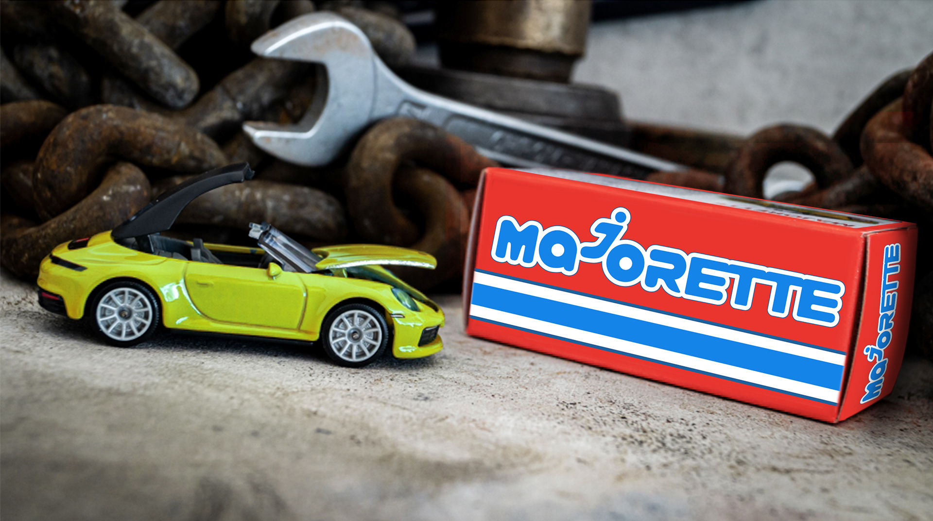
Final Design of blister box along with car for scale.
Majorette is relatively unknown in the US. In 2017, after an 18 year absence in the
country, they partnered with Toys R Us to sell their products. However, Toys R Us’ bankruptcy
the following year severely reduced the brand’s visibility. There are currently two large brands
that control most of the US market: Hot Wheels and Matchbox, both owned by Mattel.
Majorette is almost exclusively available at Target stores and relegated to a very small section of the toy car aisle.
The solution is a bright, simple redesign that looks modern while still being playful. The colors and
packaging stand out from the light blue used by Hot Wheels and the orange
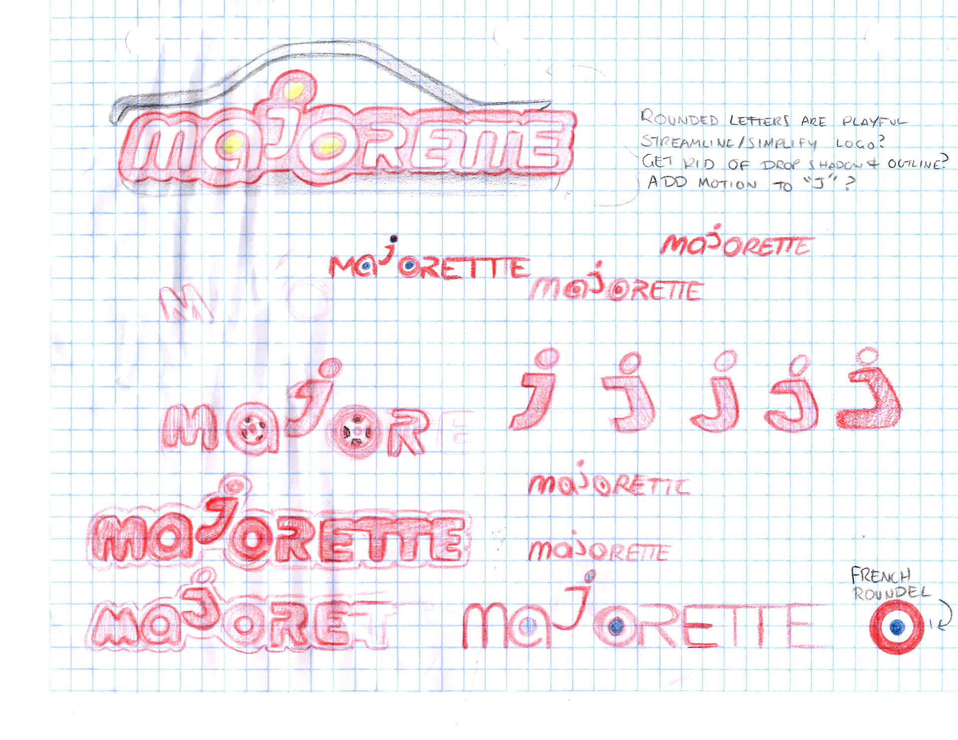
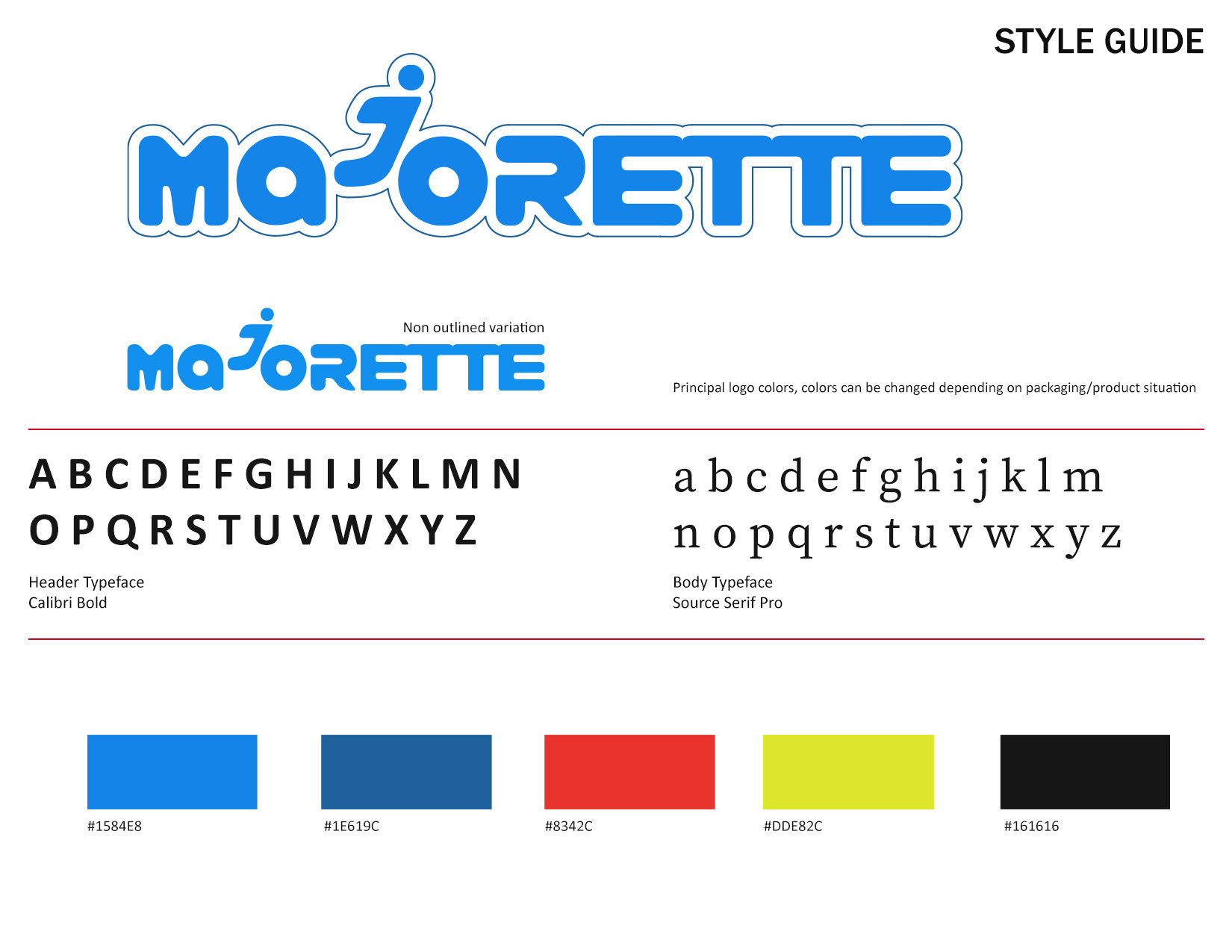
used by Matchbox. A key element I found amongst most of their logos is that the "ajo" in
“Majorette’ forms a person riding in a car, and I kept that in the new logo. The “J” has also become
its own graphical element..
packaging stand out from the light blue used by Hot Wheels and the orange
used by Matchbox. A key element I found amongst most of their logos is that the "ajo" in
“Majorette’ forms a person riding in a car, and I kept that in the new logo. The “J” has also become
its own graphical element..

Final design of box and display stand.
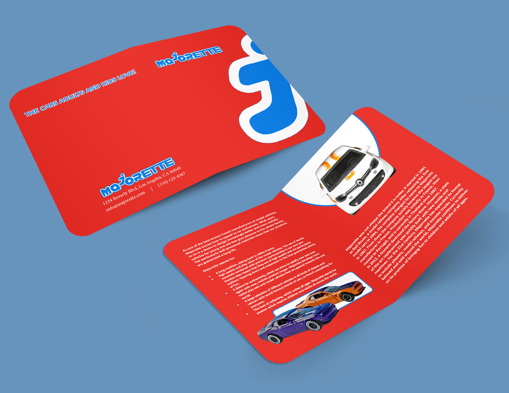
Final design of booklet.
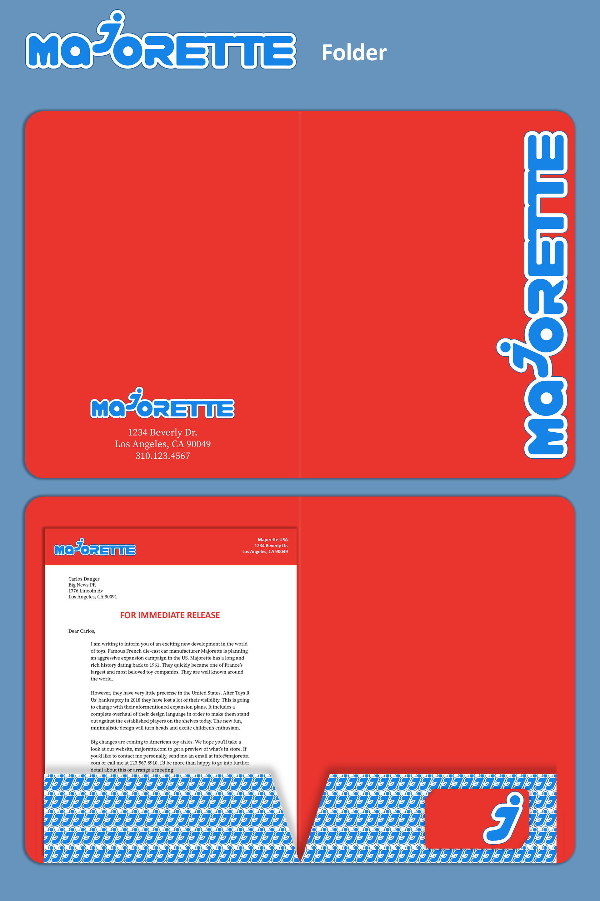
Final design of folder.
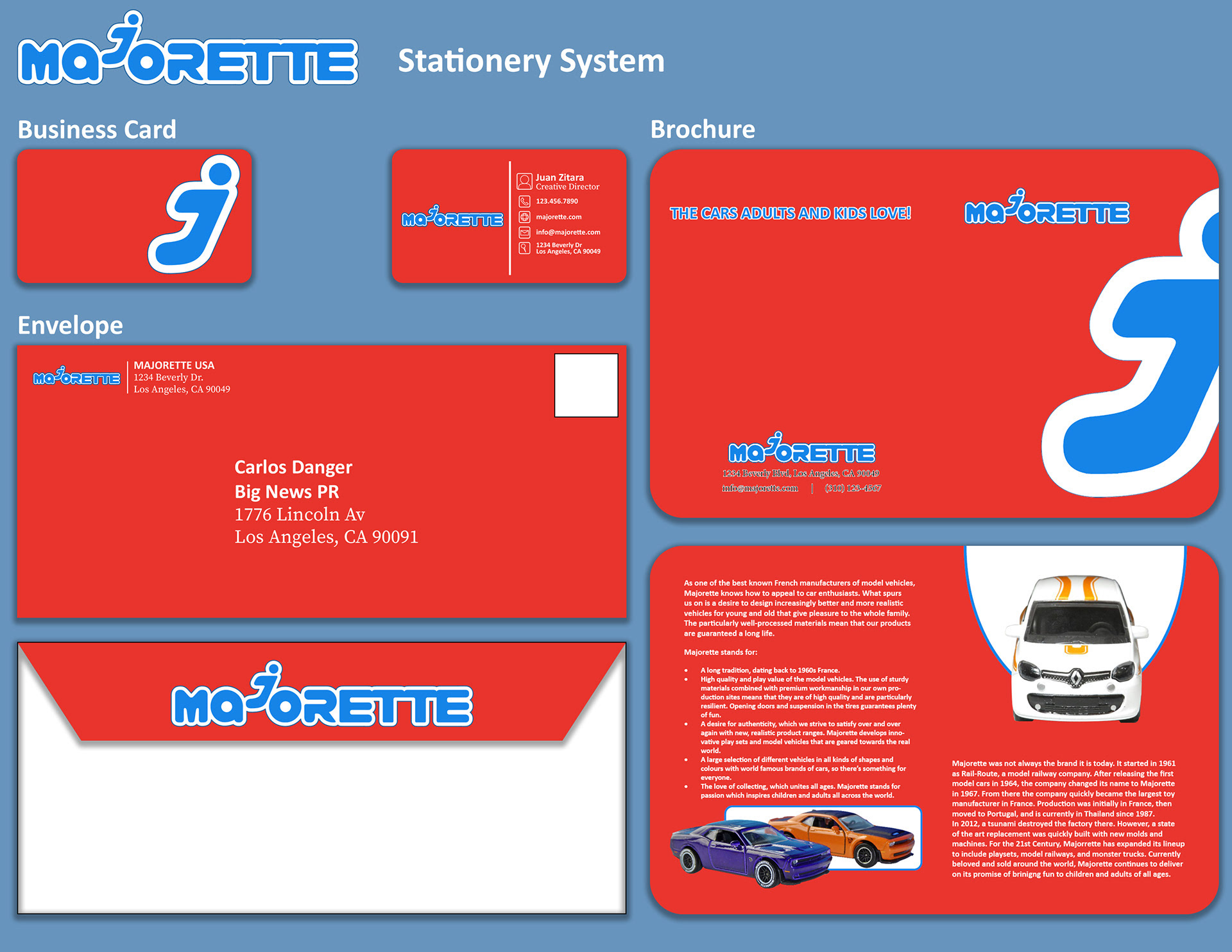
Final design of stationery system.
I started with a creative brief where I studied the brand. I researched the history of their logo,
milestones, their core values, brand attributes, their mission statement, target market and
competition.
milestones, their core values, brand attributes, their mission statement, target market and
competition.
After researching its history, competitors, values, as well as its social media; I found that
they are very proud of their heritage and kept that in mind as I was redesigning their identity.
they are very proud of their heritage and kept that in mind as I was redesigning their identity.
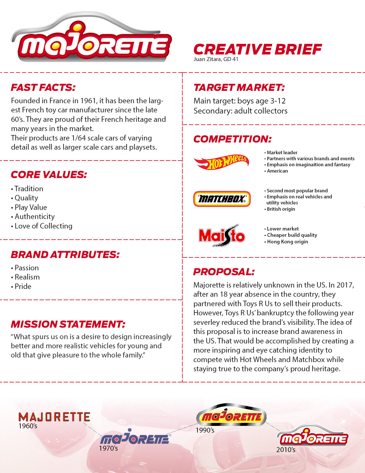
Creative brief
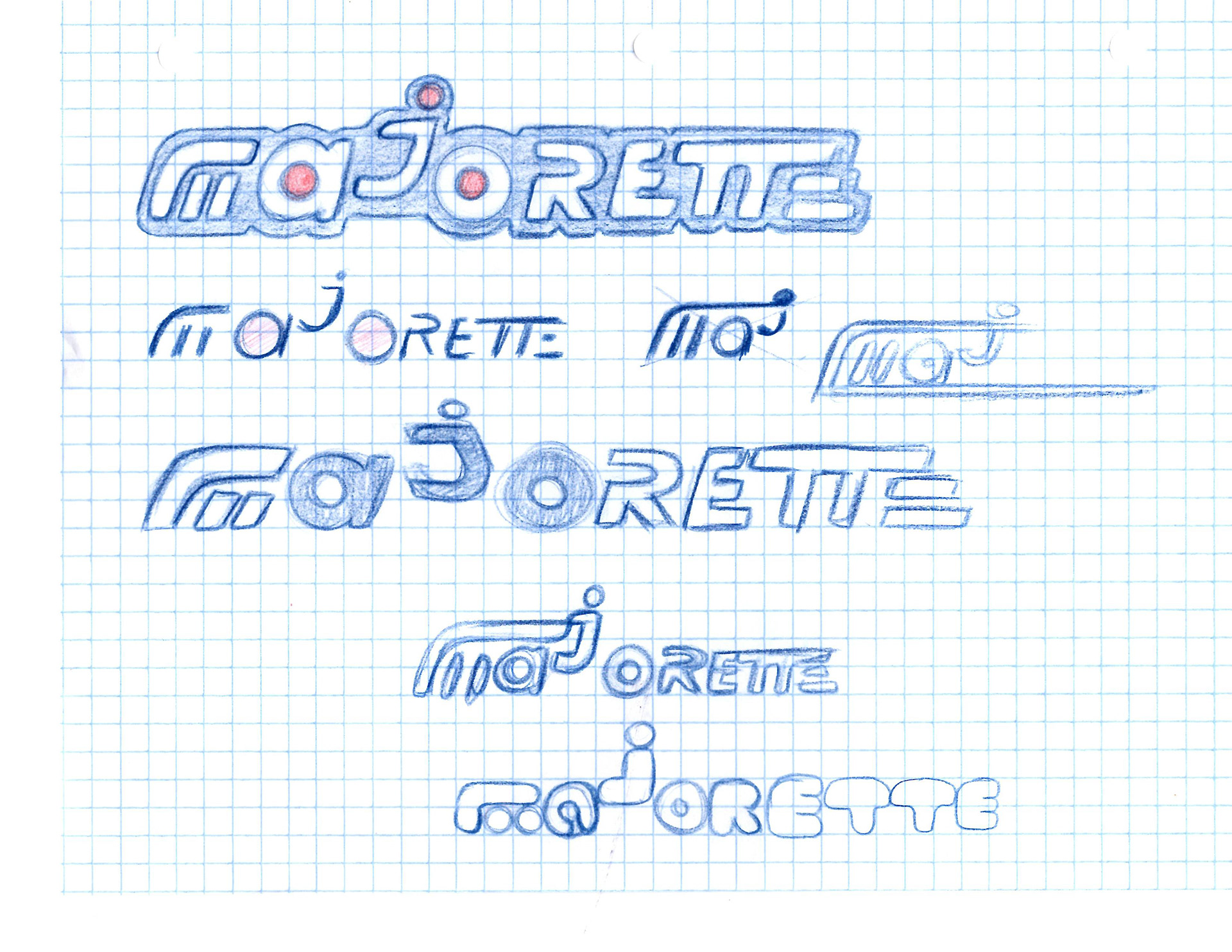
I ideated ideas for a new logo that would respect their heritage while
pushing forward into the future. As previously mentioned, I strived for preserving the “ajo”
driver motif found in almost all previous iterations of the logo.
pushing forward into the future. As previously mentioned, I strived for preserving the “ajo”
driver motif found in almost all previous iterations of the logo.
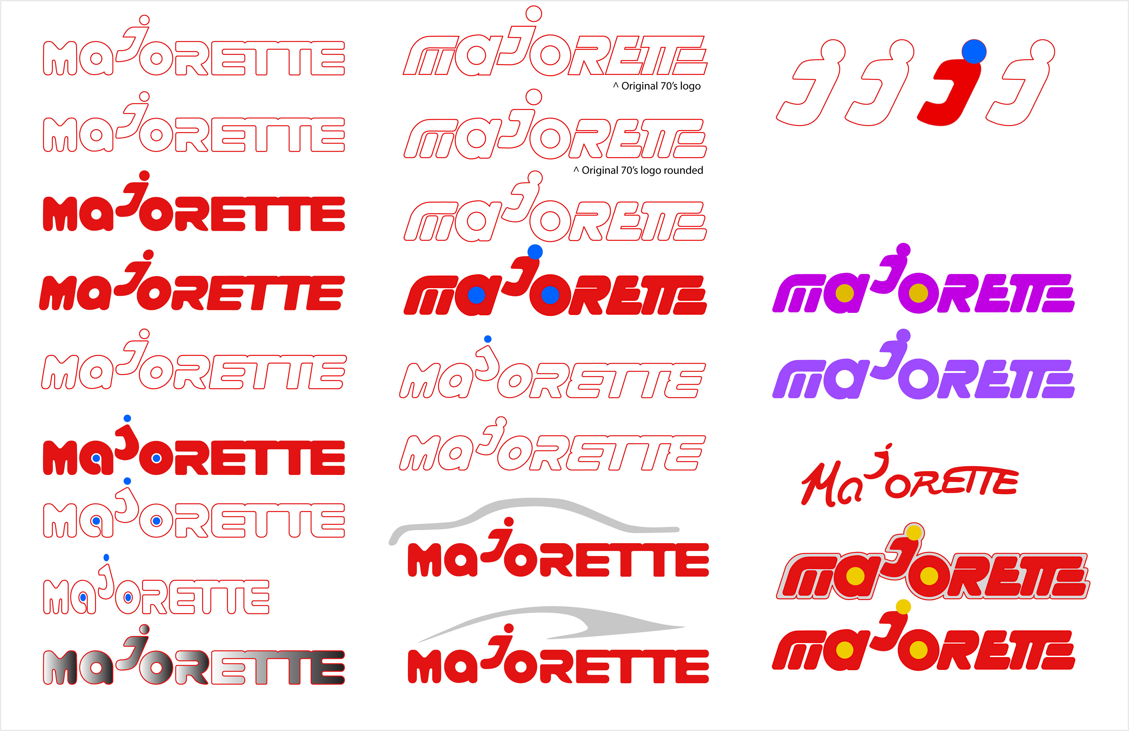
Once the design was finalized I created the style guide. The final design uses the colors red, white and blue to emulate the French flag and maintain a consistent design theme that stands out amongst Hot Wheels and Matchbox packaging. A blue and white stripe is used as a primary design feature along
with the stylized J motif.
with the stylized J motif.
The final design outcome meets the goal of preserving the brand’s heritage while
creating a unique style that sets it apart from competitors. I believe improvement could be
made on the amount of detail on the boxes. Next steps would be to create more renderings of
the style identity on products and in the real world. Furthermore, a style guide to standardize
how the packaging should be designed would be a desirable addition.