
GRAPHIC DESIGN STUDIO 2 | FALL 2020
Brief: Redesign Angie Sierra's tai chi coaching brand
Team: Kris Bumford, Amanda Ruderman, Juan Zitara
Tools used: Adobe Photoshop, Adobe Illustrator, Adobe XD, Visual Studio Code, pen and paper.
Our team redesigned tai chi and reiki coach Angie Sierra's brand. We had to create a new brand identity and apply it to a stationery system, social media page, web ads, her car, and a new website.
I was in charge of the redesigned website, part of the logo and her car's graphics.


LOGO
Our first task was to design a new logo. The three of us created our own separate proposals which we then presented along with stylescapes for how we thought the new brand identity should look and feel.

My intent with the stylescape and the logo was to create a modern and calming theme. I tried different ways to deconstruct and minimalize a lotus, which is a common iconography for tai chi. I played with different shapes as well as themes relating to the ocean because of its calming nature and Angie's seaside classes.
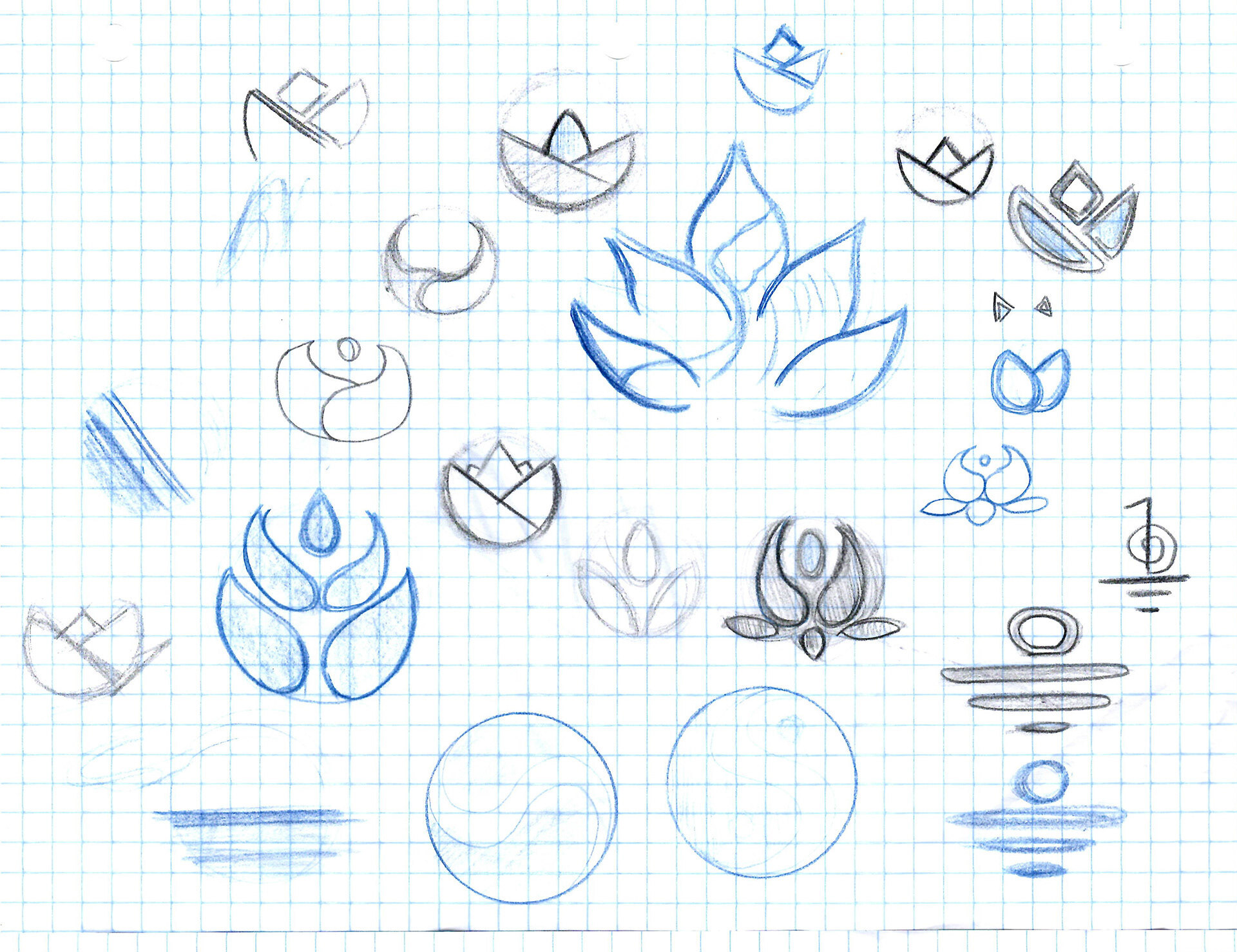
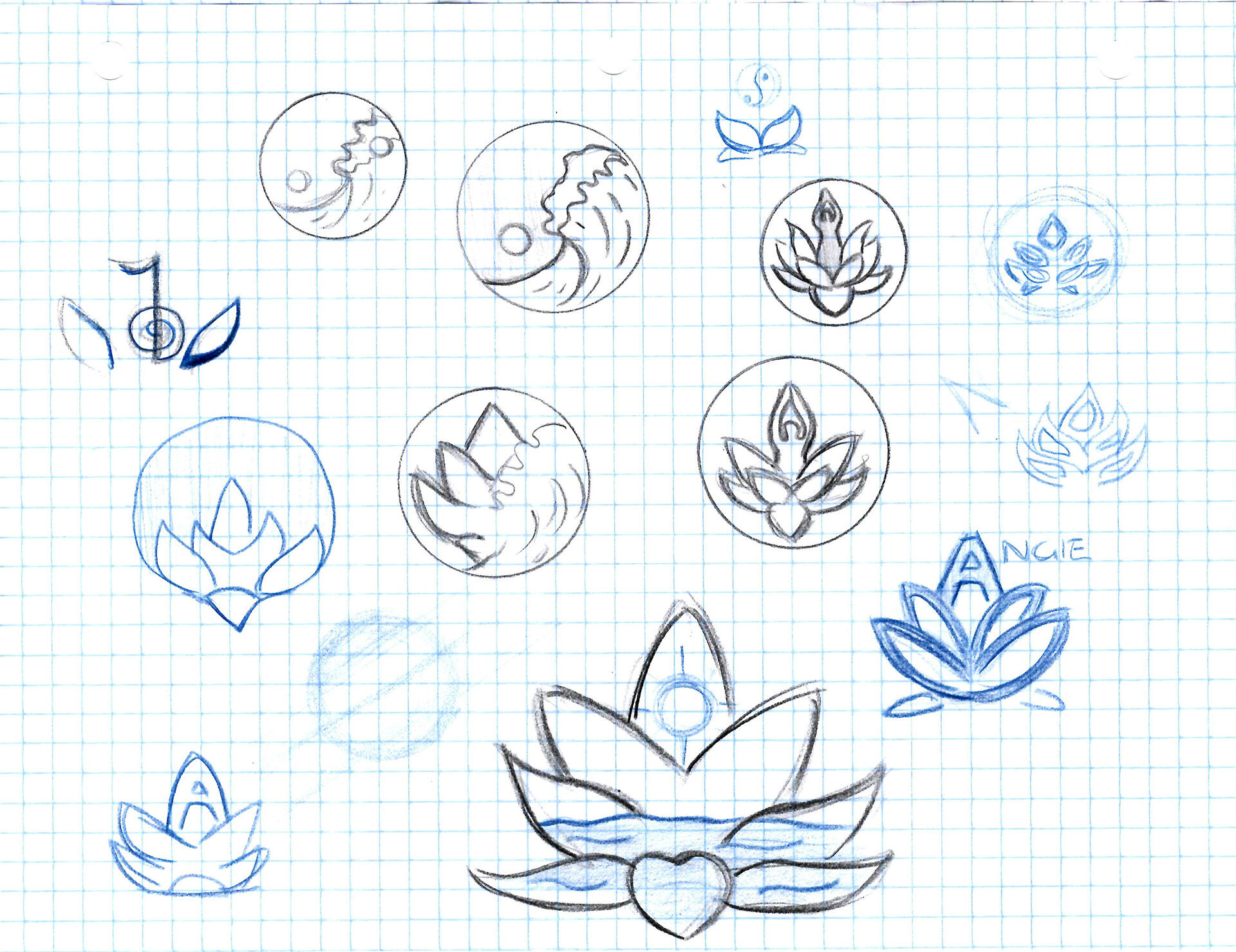
Below are the stylescapes and some of the logos done by Kris and Amanda.

Kris Bumford

Kris Bumford

Amanda Ruderman

Amanda Ruderman
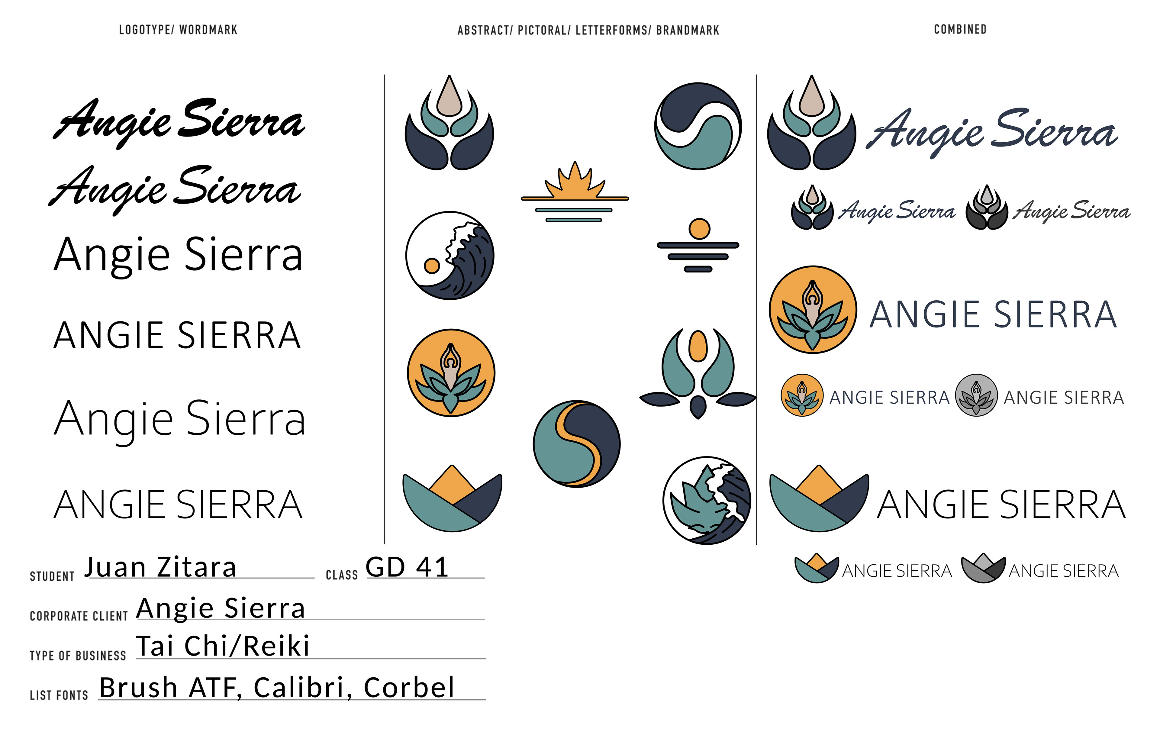
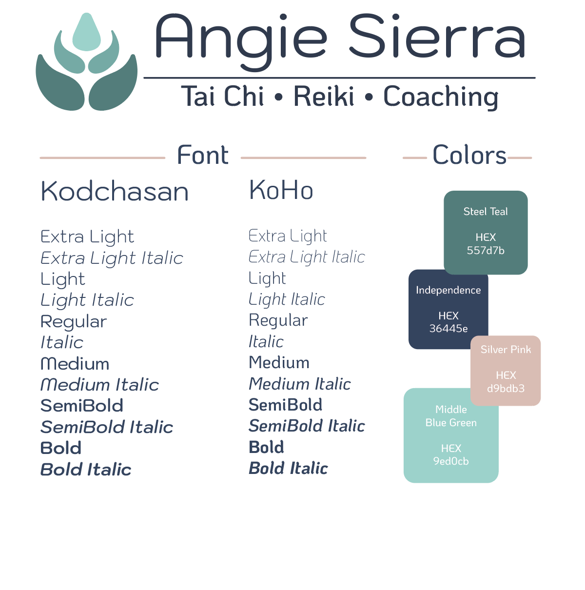
After ideating on paper I made higher fidelity versions of the icons I thought worked best. In regards to color I based it off of Kris' stylescape, which was similar to mine but had more a more mature palette. I also tried to find a way to incorporate Amanda's warm color choice. I coupled these icons with different typefaces.
Based on the feedback from my group I narrowed down the typeface to a single one and modified the icons. The pointed edges were rounded off and the stroke was either reduced or removed all together.
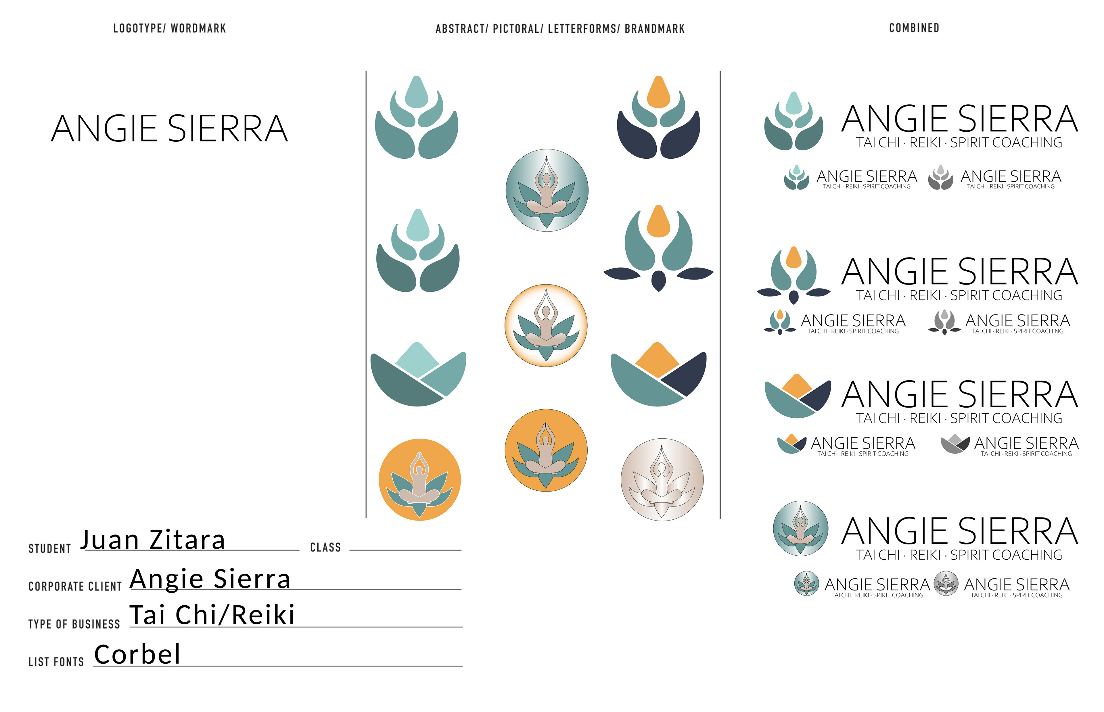
Through placing the logos on different touchpoints we decided that the best course was to combine my lotus icon with Kris' typefaces. The shape of the icon allows it to exist without the words and the typeface choice doesn't get drowned out when placed in different touchpoints.
Kris' color palette along with the lotus' green gradient were chosen as the color scheme for the brand.
Kris Bumford
CAR

For the graphics on her vehicle I wanted to evoke nature and the Earth.
I began with the white vehicle until I got more information on what her actual car was and then reduced the heaviness of the graphics to something much lighter.